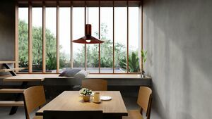
Everyone comes into the phase of life when they can buy their own house and can apply their own interior design ideas for the first time. Of course you want your home style interior design to look perfect. Ideally, you want to start designing right away. To prevent you from making unnecessary mistakes, I explain what you should pay attention to in your house interior before you start designing the internal design of your new location.
More is less
I know you are enthusiastic when you can set up your own house interior exactly the way you want. Starting with shopping and storing furniture for your own home design half a year or year in advance is therefore completely understandable. But be careful not to buy too many items and accessories for your ideal home. Sometimes it is better to create a minimalistic simple interior design. You are not the first person to make this mistake. Can I give you advice? Don't do it. The fewer items and accessories, the larger the space seems. In addition, fewer items also provide a tidy feeling in your home decor. You know what they say, a tidy room creates a tidy mind, so, less is more!.
Too little lighting
Lighting is often at the bottom of the list of priorities when decorating your home interior, but it is certainly not the most important thing. First of all, good lighting is very important for the atmosphere in a house. Whether you are working at home or your friends are visiting, matching lighting is required for every situation. In addition, lighting also has a big influence on the colours in your house interior design. It can make your space appear larger or smaller. To create the largest possible space it is important to opt for light colours. The right lighting is also very important for a more restful feeling in your ideal home house.
Creating an incoherent whole
Personally, I find it very nice to see when a kitchen and living room are connected to each other and form one large space. I love sociability and in this way you have more contact with each other than when you have separate rooms in your modern interior. The question of whether that is practical? Yes. If your space serves as several rooms, for example as a dining room and study place, then do not choose both a desk and a dining table in the same room, this creates disagreement. Go for ideal living furniture that functions for different situations. In this way you create a more coherent whole that creates a beautiful modern house decor and makes your room look less messy.
Not taking the 60-30-10 colour rule into account
The idea is that 60% of the colour forms the basis for your space. In addition, this colour also serves as a background in your cute house interior (in the picture above its white). 30% is the secondary colour. These can be chairs, couches, a carpet or maybe a single wall. The idea is that the secondary colour supports the main colour, but is different enough to distinguish them from each other and make the space interesting (in the picture above its blue). The remaining 10% colour is your accent colour (beige in the picture above). For a living room, these are small accessories. Too many of the same colours create a dull interior. So keep this in mind when selecting the colours so that you do not ruin your internal decoration. Using the 60-30-10 rule makes choosing colours easier and achieves a balance in decoration.
Co-ordinating everything
Avoid that everything in your beautiful home decor is perfectly coordinated. So make sure that you do not have the same pattern of wallpaper as the tablecloth, for example. Buying furniture from the same series is also no longer of this time. In my house decoration we have totally different armchairs in the living room that ensure a cozy atmosphere. Match different colours and materials for a playful home interior. So it looks like your house comes straight out of an interior magazine.
Your photos and paintings are hanging too high
Many people go wrong here. To create space in a house design, you want the ceilings to be as high as possible. Many people place their wall decorations such as paintings and photographs at a height that you look at when you are standing. This does not make sense when you consider that you often look at a painting when you are sitting. So place your wall decorations at eye level. This makes your ceiling looks higher.
Are you still not satisfied with the layout of your house interior? Do not stop figuring out how you want your home interior. Your living room does not necessarily have to be complete when everything is perfectly in place. Also, make sure that your decor matches your personality. After all, what's the point of having a perfect house that you do not feel happy in?
I hope that by reading this article you will avoid making these mistakes in your house interior. It is never too late to change something about your house design.


